New – Old Look and the Aesthetics of Blogging
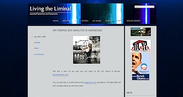
Recently, I’d done a major change to the look of LtL:

And I liked it, I really did. I was proud of the background and how it integrated with the header image, and I liked the header image too – the colors really pop and provide a cold luminescence that is both bright but also gives the sense of something gritty. But after only a few days I’ve returned to a very simple and clean look because, in the end, the experience I want to offer on this site is primarily one of reading. I mean, sure, I’ve got my music and sound design pages, and I post YouTube videos on a regular basis to share neat stuff with friends, family and the few strangers who stop by, but the main purpose is to communicate thoughts, ideas, essays, stories, half-baked arguments, crazy theories, daily minutia, etc. I found the new design to be overly aggressive, distracting from the main point.
I’m glad took the time to play around with the CSS to the level that I did, and I may very well clean the theme up and post it on the WordPress themes site for others to use. I’ll probably use the background over at my Sound Design site LtL Sound. For now, at least for Living the Liminal, I’m sticking with an aesthetic that highlights the text and the entries and offers little to no distraction. I’m even going to leave the header sans image for now, until I find something I feel fits the aesthetic that I’m going for.
I want to give Ash Hague a big thanks for his simple and clean designs. I’m actually using them on both LtL and Letters to Lost Friends. I find that I tend to tweak the fonts and font sizes a bit, but other that that, his themes are simple, clean and elegant (and though rounded corners would be cool, my recent experiments with themes over at Letters showed me how tricky those can be).
On this day..
- Super bummed - 2012
- Far From Perfect - 2011
- And Something Else Happened Instead . . . - 2011
- Superheros Do Exist Thanks to Make-A-Wish - 2010